Project Objectives
Develop visual understanding of the differences between subject matter and form.
Intentionally transform a representational design into an abstract or non-representational design to convey Content.
Develop visual understanding of the Element of Design Value --Intro-- through Line repetition.
Develop visual understanding of the Principle of Organization Movement/Rhythm.
Project Description
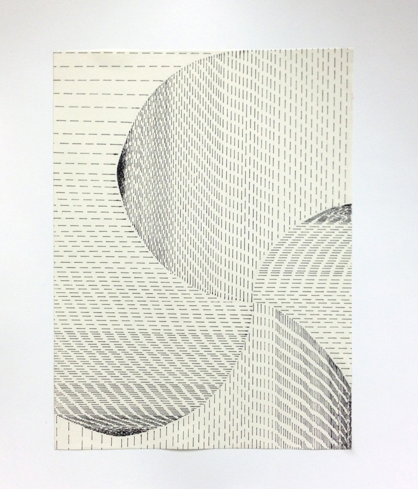
In this project you continue to exercise ways to abstract from Subject Matter while focusing on Form by exploring shaped value gradation through Line placement, proximity, and size. When used repeatedly, lines create a directional flow, causing for the viewer’s eye to move around the picture plane. When these lines create an obvious sense of motion across the picture plane, this is called Directional Dominance. To better understand the Principle of Organization: Rhythm | Movement we will explore how utilizing repetition with the use of line, a strong sense of movement, or rhythm can be established.
Required Materials
9" x 12" Drawing Paper 14” x 17” Bristol Board Sketchbook HB Mechanical Pencil Eraser Ruler PITT Pen (Black) Rubber Cement
Step-by-step Directions
Step 1: In your sketchbook execute Line Systems and Value Gradation
Step 2: Using the scales of value gradation you created in Step 1 as a reference, sketch at least four (4) 3”x4” thumbnail compositions in your sketchbook with the PITT pens that adhere to the following criteria:
Create a composition using many small lines to create one main directional dominance. This will establish a visual flow within your design.
Ways of creating directional movement:
. Changes in direction.
. Changes in darkness or lightness.
. Similar shapes connected with each other.
. Overlapping elements.
. Repetition of elements.Create visual depth by creating a broad range of values. “Compressed” space is established by making the marks smaller and very close together. Create some “expanded” space by making the marks a bit larger and with greater spaces between.
Create a directional conflict by changing line direction in at least one area.
Utilize implied lines through line direction and/or utilizing negative space.
As always, compositions must establish a focal point and visual flow utilizing the principles of design. **Hint: Value Contrast & Directional Conflict are both excellent ways to establish emphasis.
Step 3: Present the four (4) thumbnail sketches to Prof. Jacques.
Step 4: Re-create the strongest composition on a 9” x 12” drawing paper with your PITT pens. Use the various pen nib sizes (S, F, M, B) to create variation of line thickness and character. Your drawing should take up the entire field.
Step 5: Once your drawing is complete, mount it on the 14” x 17” sheet of Bristol board using your rubber cement. Make sure the drawing is centered; use your ruler to create guidelines with pencil before gluing.
Project Considerations
Does the composition utilize the entire picture plane?
Is there unity through continuation, repetition, alignment and/or proximity of elements?
Is the composition asymmetric and dynamic?
Are all areas of the picture plane activated?
Is there a strong focal point on one of the power points of the rule of thirds?
Has a strong directional dominance been established?
Has a directional conflict been established?
Are there implied lines in my composition?
Are there at least five (5) different values created by my use of line systems?
Has the final design been executed in a professional manner? Designs should utilize the designated materials with care, effort, and attention to detail. This includes proper mounting to Bristol Board.
CRAFTSMANSHIP is extremely important for each of your designs and is part of the grading criteria. Do not fold, bend, crease, smudge, tear your artworks! Always take great care when creating each design and then put directly into your portfolio case.
What is Craftsmanship? Care in construction and finishing; demonstration of skill and knowledge of processes; attention to detail. The quality of design and work shown in something that is made by hand.
Project Delivery
Executed Part 1.
Created 4 thumbnail sketches following the guidelines.
Presented the 4 thumbnail sketches to Prof. Jacques.
Created final design of best composition.
Presented final design mounted on Bristol board.
Grading Criteria
This project is worth 5 points.
Project's Grade Rubric
Craftsmanship & Materials: The final design has been executed in a professional manner.
The designated materials are intentionally utilized with care, effort, and attention to detail - cut, pasted, and properly mounted to Bristol Board.
Design utilizes the appropriate papers, paper sizes and pens.
Composition: The composition utilizes the whole picture plane, is dynamic with strong visual flow, containing a clear primary focal point adhering to the rule of thirds.
Elements of Design: The design is abstracted from subject matter, line qualities are skillfully utilized to create a full value range and establish a strong directional dominance and conflicts. Intentional usage of line width, length, proximity, implied lines.
Principles of Organization: The design presents a strong sense of movement by establishing directional dominance and directional conflicts. Rhythm, Emphasis and Focal Point, Unity and Asymmetrical Balance are clearly observed in composition.
Part 1 | Line Systems and Value Gradation
Extra-credit Sketchbook is worth 0.5 points:
Created 4 thumbnail sketches (0.5).

